5 Costly Mistakes Architects & Property Developers make with CGI Animations
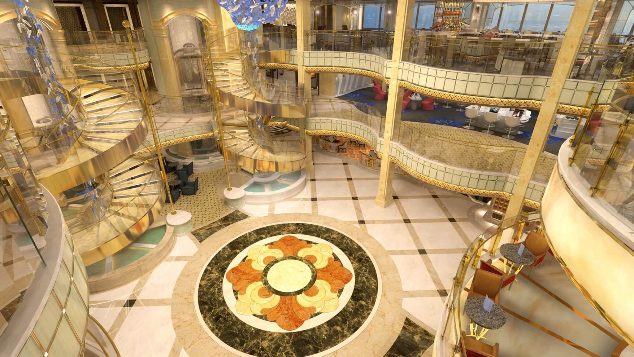
Source: Cruise Ship – Majestic Princess for Princess Cruise Ships by Digital Frontier
Pre-Construction, CGI Animation is the most powerful tool for Architects & Property Developers to sell their ideas. It brings the designs to life and–if done right–can look even better than the finished product. But CGI renderings are also very costly and time-consuming, and making mistakes at the beginning can have big consequences down the line.
This article will explore the 5 most common mistakes Architects & Property developers make when ordering their CGI building animations, and how to avoid them.
Mistake #1: There is Often a Different Agenda Between the Architect/Designer and the Developer.
An architect and a developer have two quite different points of view, indeed the architect is concentrating on the design and making the design as attractive, unique, functional and effective as possible.
The developer on the other hand, has a whole different set of priorities – a lot to do with money – a lot to do with marketing. This difference leads to a huge contradiction in the production of an animation – almost exclusively commissions for animation are used to sell property – not to design property – and the demands of these two features slow down the whole process to a crawl.
Sitting down and creating a proper brief if the first part of the process – making a list of what needs to be conveyed to the audience is essential. You need to make sure the designer and developer are working off the same page – it is no use the designer working on an animation when the developer hasn’t signed off on it – chances are high that the second person to look at it will make changes.
Mistake #2: Thinking of Your Animation is a ‘Fly-Through’ and Not a Movie
Breaking an animation up into relevant scenes is exactly like the director directing a movie – you can feature what needs to be features in exciting ways – dramatic cameras, interesting viewpoints, snippets and teasers to get the audience involved. Therefore the clear and unequivocal requirement is to tell the director what is required to be featured and then let the director set up the camera moves and design the scenes. An animation has to be a movie if it is to be successful and movies are made up of scenes. Properly set up scenes peak interest from the audience – they WANT to watch the animation and in watching they absorb the key messages that the animation is giving them.
Mistake #3:Trying to Oversell Your Design/Development and Get Every Single Feature into the Animation.
The key to successfully showing your development or design is picking the features that best attract the target audience. For your animation to be truly effective, it needs to communicate exactly the right message – presented in exactly the right time sequences. The client must be entertained and subtly moved to action – featuring less and making it more is what sells property. Animation is the single most effective to sell unbuilt property – it is the virtual equivalent of building the building.
Mistake #4 : Not Giving Enough Time to Create the Animation and Not Understanding the Process.
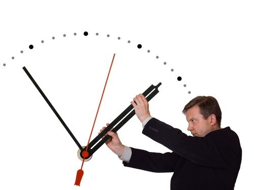
Animation is expensive because it takes a lot of time. The more time that can be spent on the animation the better the quality. Time spent comes down to different factors – time actually creating the animation and time spent revising the animation – these are two completely different things. Generally speaking a 3 minute animation takes around 3 weeks of time with 3-4 people working on it – that time is if one set of plans is provided, the brief is clear and unambiguous, there is one person responsible for the comments, and the entire process is followed properly.
Give the animation company enough time and follow the process so the time spent is actually on making a quality product and not on making changes and reworking what has already been done.
Mistake #5: Not Understanding Rendering Resolution and how Different Equipment and Different Usages Require Different Resolutions.
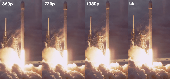
The difference between the highest HDTV and the lower HDTV is around 7 Billion pixels. Computeing time is determined by the number of pixels rendered so rendering-times for the same project at different resolutions can increase by 3 or 4 times!
All that translates into massive time differences in all parts of the process. Texture maps have to be nearly 4 times as dense, quality settings have to be 4 times as high, editing times are 4 times longer, rendering time is 4 times longer – all adding up to a massive amount of time and effort. And then there is the final kicker – the output size of the animation at the highest resolution is HUGE – 4 times the lower HDTV size – so if the lower output size is say 2 GB then the higher output will be around 8 GB’s – and that means the computer or DVD playing the animation must be able to handle big file sizes.
When you see an animation playing jerkily it means the computer is unable to process the information fast enough, that means either a low spec computer or a huge file size for the animation. The tip here is to provide clear instructions and consider the exact situation you will be displaying your animation before even starting the process.
Wrapping Up
We hope this advice can help you in any future property visualization projects. To keep up with the latest in property visualizations & architectural trends bookmark our blog and check back weekly!
VR Property Sales Suite


 Click to Learn More
The 4 Reasons Chinese Property Buyers Buy

 Accessing High Net Worth Investors in China


